Space Utilization
The Space Utilization dashboard shows Occupancy and Booking Insights for a floor, building, or portfolio.
- Includes information about conference rooms, huddle areas, phone booths, or any other spaces configured in your Connect solution
- Helps your organization understand how and when spaces are being used, which spaces are used most and least, and booking trends
- Floor map view provides geographic context about specific spaces and usage patterns
Available Insights will vary based on the features implemented for your organization.
Review the Available Metrics.
|
Occupancy – Space-level reporting for occupancy is dependent on the presence of sensors.
Booking – Room-level reporting for bookings requires setting up room bookings in Connect. Rooms that are not set up for reservations will be excluded from reporting.
|
Navigate to the menu item > Space Utilization.
- Select the type of data to look at: Occupancy or Booking
- Select Floor, Building, or Portfolio view
- Select the Building and Floor to analyze
- Refine data by Traits, Dates, and Day of week
- To narrow the hours of the day, slide the start and end pins on the 24-hour time bar
- Click the Download as PPT button to generate a PowerPoint (PPTX) file with charts for the selected building, floor, and other configured details
- Hover over the 'i' icon on each data chart for an explanation
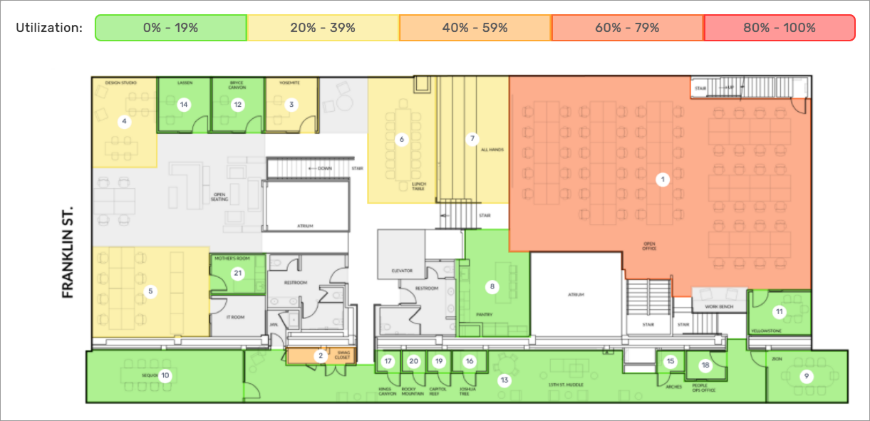
- Colors on the floor map indicate the most and least used rooms; green indicates least used, red means most
- Click a room on the floor plan to open a popup with details
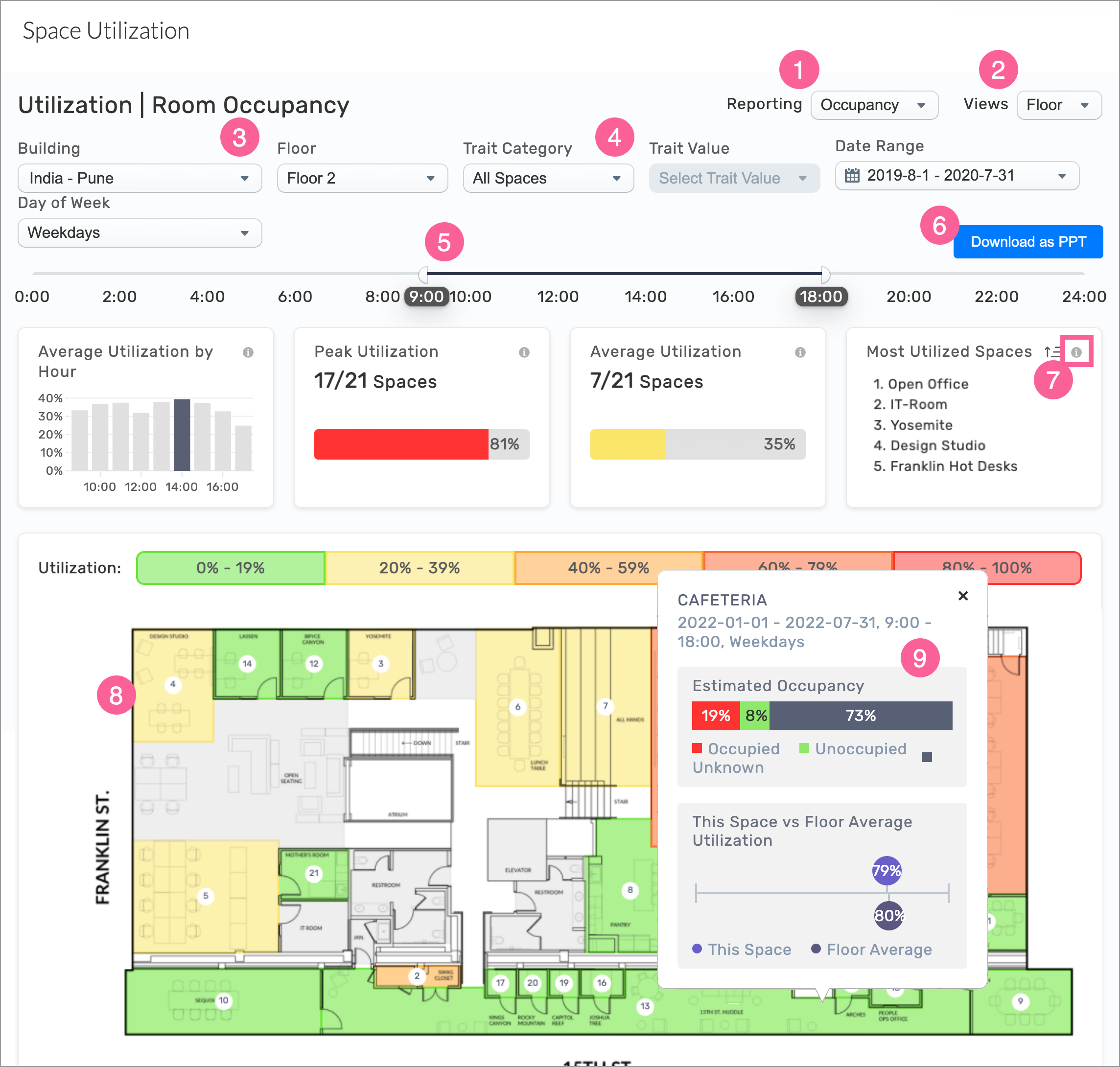
Example: Utilization – Room Occupancy > Floor view with Map
Desk Utilization
Administrators can use the Desk Utilization dashboard to understand how employees are reserving and using desks:
- How many desks are being used over time
- Which desks are most popular
- Busy booking and usage times
- Advance desk booking trends
- Desks utilization details on a floor map
Review the Available Metrics.
|
Occupancy – Desk-level reporting for occupancy is dependent on the presence of desk sensors.
Booking – Desk-level reporting for booking requires setup of desk reservations in Connect. Desks that are not set up for reservations will be excluded from reporting.
|
Navigate to the menu item Desk Utilization.
- Select the type of data to look at: Occupancy, Booking, or Future Booking
- Select Floor, Building, or Portfolio view
- Select the Building and Floor to analyze
- Refine data by Traits, Dates, and Day of week
- To narrow the hours of the day, slide the start and end pins on the 24-hour time bar
- Click the Download as PPT button to generate a PowerPoint (PPTX) file with charts for the selected building, floor, and other configured details
- Hover over the 'i' icon on each data chart for an explanation
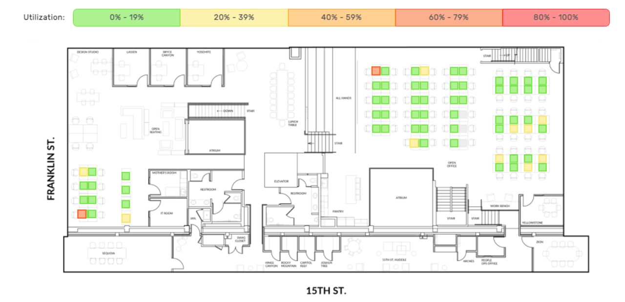
- Colored squares on the floor map indicate the most and least used desks; green indicates least used, red means most
- Click a desk on the floor plan to open a popup with details
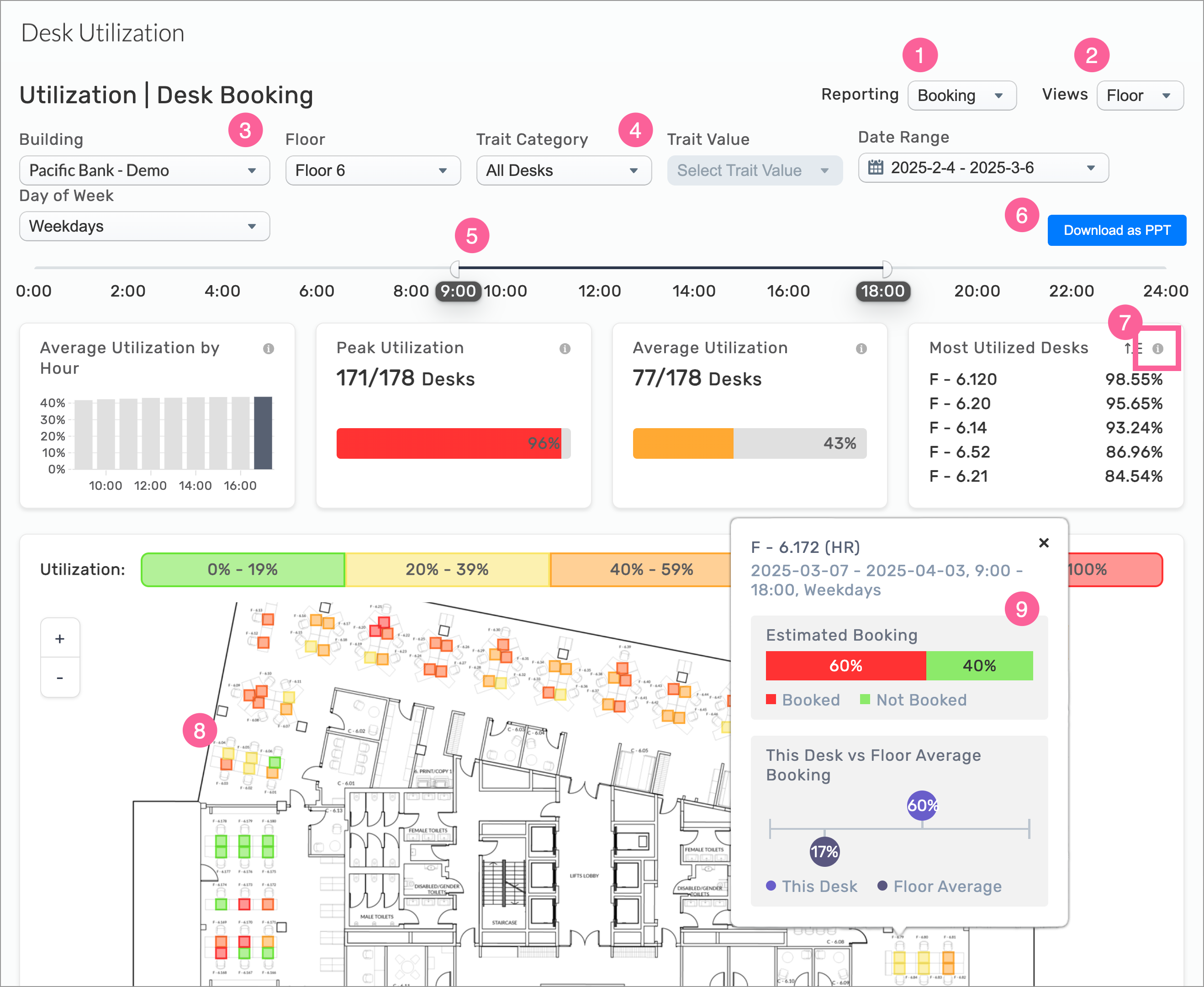
Example: Utilization – Desk Booking > Floor view with Map
INSIGHTS – Available Metrics for Space and Desk Utilization
The following metrics are available for both the Space and Desk Utilization dashboards.
- Utilization is defined as at least 25 minutes of occupancy during a one-hour time block.
- The minutes of occupancy do not have to be consecutive.
- Color corresponds to the same range as the space utilization map, with red representing the highest utilization.
- The data includes information up to the end of the previous day.
|
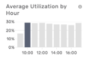
Average Utilization by Hour
Shows the average percentage of spaces utilized during each hour of the date and time range specified. The hour of highest utilization is bolded. Each bar represents the same value as “Average Utilization” for that hour in the same time range.
|
|
|
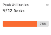
Peak Utilization
The bar chart shows the maximum number of spaces used simultaneously during the specified date and time range, representing a single hour of peak utilization. Color corresponds to the map scale, with red indicating the highest utilization.
- Peak Booking Percentage: For each 1-hour time interval, the function calculates the utilization percentage:
- (Booked Hours/Bookable Hours) × 100
It then identifies the maximum (peak) percentage across all intervals and rounds the result.
- Peak Number of Objects Booked (Peak Booking Count): Using the peak booking percentage, the function estimates the number of desks (or bookable objects) booked at peak time:
- (Total Desks × Peak Booking Percentage/100)
This approximates the number of desks used during peak periods. For example, with a peak booking percentage of 75% and 20 desks, the peak booking count would be 15 desks.
|
|
|
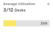
Average Utilization
The average number of spaces utilized during the date and time range specified.
|
|
|
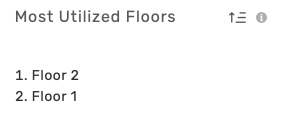
Most Utilized
Desks/Floors/Building
Lists spaces (desks or floors, depending on the selected view) ranked by utilization during the specified date and time range. The list can be reversed by clicking the icon in the top-right corner of the list.
|
|
Occupancy or Booking, Floor View
Floor Map, Rooms
Color indicators on the floor map quickly show the most and least used rooms, by occupancy or booking, with green indicating least used, and red for most.
|
|
Occupancy, Booking, or Future Booking, Floor View
Floor Map, Desks
Desk color indicators on the floor map quickly show the most and least used desks, by occupancy or booking, with green indicating least used, and red for most.
|
|
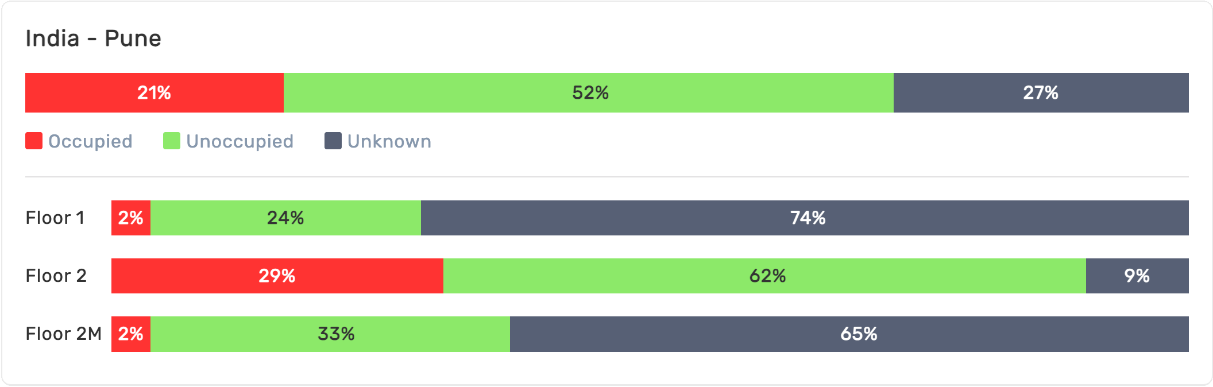
Occupancy, Building View
Floor Utilization
Stacked bar chart showing the aggregate utilization of spaces across all floors in the building, as well as the utilization data for each floor.
|
|
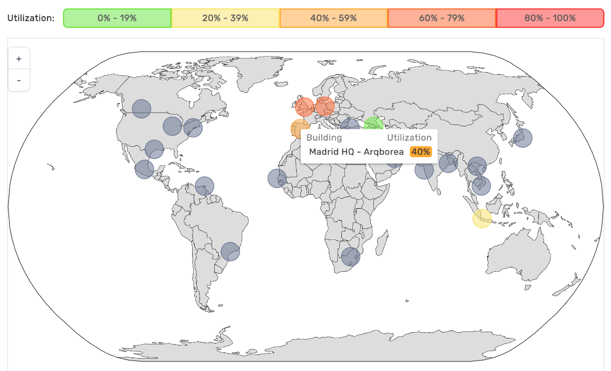
Occupancy, Portfolio View
Global Map
The Portfolio View displays aggregate utilization data for all spaces across all buildings within the organization’s Connect implementation.
|
Each region where a building or campus is located is displayed on the world map, showing the utilization data for individual buildings. Utilization data for each building can be viewed by clicking on each region. Green circles indicate lowest utilization, while red indicates highest. By zooming into areas of the map, the metrics above the world map update automatically to reflect only the buildings/regions displayed.
|
All Insights Dashboards

