The Enlighted Connect Insights dashboard, Core App Engagement, provides visibility into how many employees are interacting with various parts of the Connect App. The dashboard displays statistics and information on changes over time, such as the number of users interacting with the app, the features they are clicking, and the frequency with which different homepage cards are clicked. This engagement data is available in monthly time periods (which you can adjust), with detailed data displayed in weekly and hourly intervals.
Available Insights will vary based on the features implemented for your organization.
Navigate to the menu item > Core App Engagement.
View details for the Available Metrics.
INSIGHTS – Available Metrics
The data includes information up to the end of the previous day.
|
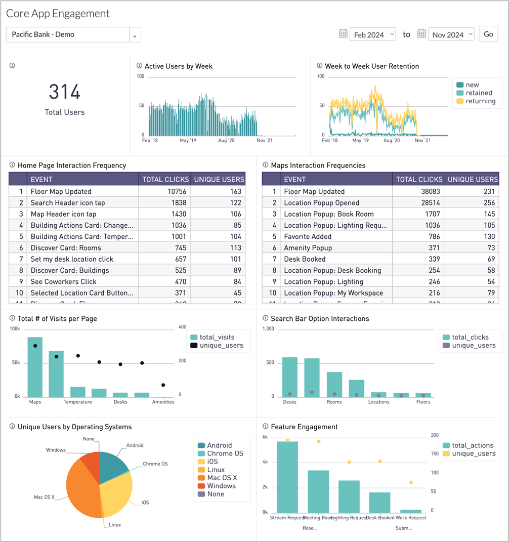
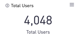
Total Users
Displays a count of all employees who have interacted with the Connect App in some way during the selected time period.
|
|
|
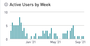
Active Users by Week
Bar chart shows the number of unique users who have visited the Connect App each week in the selected date range.
|
|
|
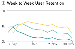
Week to Week User Retention
Line graph shows week-to-week user retention:
- New users
- Retained users – users who used Connect in consecutive weeks
- Returning users – users who used Connect multiple times but not in consecutive weeks
|
|
|
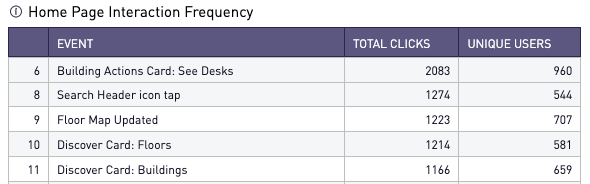
Home Page Interaction Frequency
Table includes all possible home page interactions with total clicks and unique users.
|
|
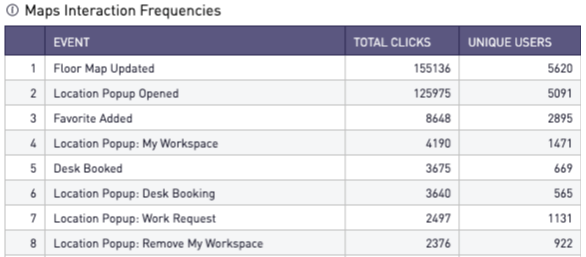
Maps Interaction Frequencies
Table includes all the possible actions on the Maps page, broken out by total clicks and unique users. "Location Popup" refers to the popup that appears when a user clicks a point on the map.
|
|
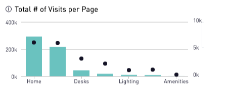
Total Number of Visits Per Page
A combined chart displays the total number of visits to each page (bars) alongside the number of unique users making those visits (points).
|
|
|
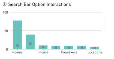
Search Bar Option Interactions
A combined chart shows the number of clicks on the search icons (magnifying glass) that appear in the expanded search box. It is broken by total clicks (bars) and unique users (points).
|
|
|
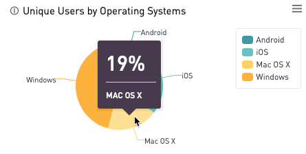
Unique Users by Operating System
Pie chart reflects what percent of unique users are using each operating system.
|
|
|
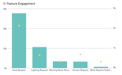
Feature Engagement
Chart shows all the advanced features, including those for individual cards on the homepage that your organization has configured, reflected by the total number of actions (bars) and number of unique users (points).
|
|
All Insights Dashboards

